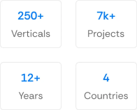
150+ minds across 4 countries. Join a culture of innovation, ownership & growth.
Rewire for AI
From machine learning to deep learning, from classification tools to overall process automation – our AI engineers will help you retool your existing system or enhance your company results.
Ship faster, scale smarter, built for product companies and SaaS teams
Our Latest Work
We strive hard to deliver result-driven digital solutions across the globe. Check out our case studies to get a glimpse of how we ideate, innovate, and create unconventional digital solutions according to the requirements of our clients.
Discover diverse and passionate insights from our tech enthusiasts. We collaborate across various sectors to streamline operations and drive innovation. Explore our rapidly growing collection of articles to see why we’re at the forefront of IT solutions.
The decision to move from Magento to Shopify is one of the most significant replatforming choices an ecommerce business can make. Magento is powerful, but its power comes with...
Accuracy gap is real: Traditional CPG forecasting carries a 25-40% MAPE error rate. AI-powered models bring that down to 8-15%, according to McKinsey research....
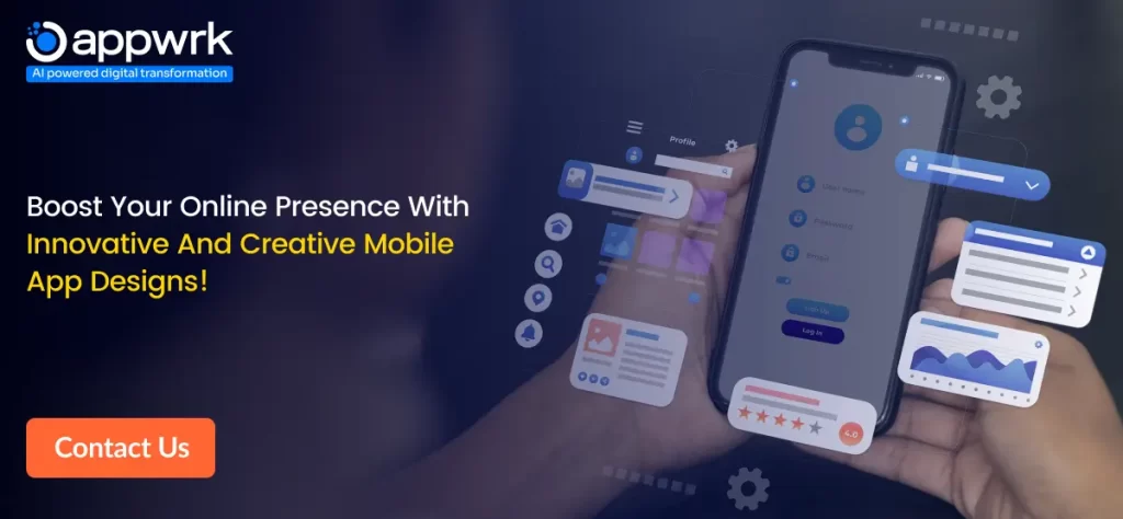
In today’s highly competitive mobile app market, UI/UX design can make or break your app’s success. Not only does a seamless and intuitive mobile app design foster higher customer satisfaction and encourage positive reviews and recommendations, but it also boosts app downloads and revenue. According to Forrester, top-notch UX design could lead to a 400% increase in conversion rates.
From intuitive navigation to responsive layouts, from visual aesthetics to security measures, the key considerations for mobile application design are vast and intricate. Needless to say, mobile app design plays a crucial role in market capitalization and customer satisfaction. You can understand 20 UI/UX principles for designers use by reading this ultimate guide to mobile app design.
Let’s explore the mobile app UX design best practices for designing a compelling app that retains users.
But before getting into the nitty-gritty, let’s find out what mobile app design is.
Mobile app design refers to the process of creating intuitive animation and visuals for your mobile app. It encompasses everything from user interface (UI) design, which includes all the visual and interactive elements, such as buttons, graphics, and icons, to user experience (UX) design, which includes all the interaction scopes, structure, and content that enhance users’ engagement.
The overall goal of mobile app design is to create an app that is visually appealing and easy to use. A well-designed app will provide users with a positive experience, encouraging them to continue using it and recommend it to others.
In today’s competitive market, a well-designed app is more important than ever. Users have high expectations for mobile apps, and they will quickly abandon an app that is difficult to use or unattractive. By investing in mobile app design, you can create an app that stands out from the crowd and provides users with a positive experience.
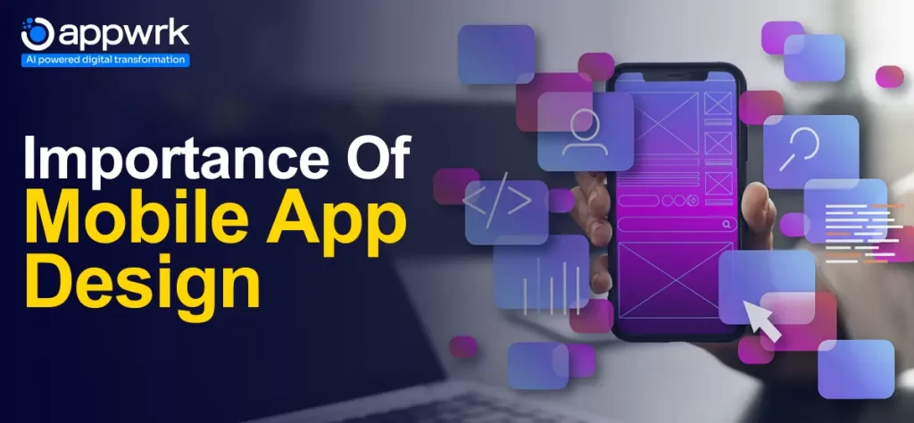
Importance of Mobile App Design
In the fiercely competitive mobile app market, user retention and engagement have become paramount. Building a great mobile app UX ensures users find your app memorable and engaging, increasing the likelihood they will buy from you. A well-designed mobile app not only attracts users but also helps to engage them with an intuitive and easy-to-navigate user experience. Here are five key reasons why mobile app design is important:
Enhanced Satisfaction: A well-designed mobile app with an intuitive and seamless user experience leaves a positive impression on users and ultimately increases their overall satisfaction.
Increase Engagement: Mobile apps with exceptional design and user-friendly interface encourages users to spend more time on the app, and this leads to increased user engagement.
Improved Retention: Mobile applications offering exceptional user experience are often used repeatedly by users. When a mobile app is smooth and enjoyable, provides value to users, and meets customer expectations, users are often inclined to use it, which results in increased user retention.
Competitive Advantage: In this fiercely competitive mobile app market, user interface and user experience are often treated as differentiating factors. A mobile application that is designed and offers excellent user experiences can stand out from the competition.
Positive Brand Perception: A positive user experience plays a crucial role in building an overall brand perception. When users have a pleasant experience while using the mobile application, it is normally seen that they usually stick to that brand or company.
Differences Between Mobile App and Desktop UI/UX Design
In the dynamic UI/UX design world, understanding the distinct requirements of mobile and desktop platforms is essential. Whether you want to create a mobile app to complement your website, reach a new audience for your business, or just think you have a great idea for a new app, mobile app design plays a major role in your app’s success, and recognizing these differences allows for creating more effective, user-centric designs.
Listed below are the major differences between mobile app and desktop app UX design:
Screen Size and Layout Design: Desktops offer expansive canvases, typically 24 to 30 inches, enabling intricate layouts and detailed graphics. Mobile devices, with screen sizes averaging 5 to 7 inches, require a minimalist approach.
Accessibility: Accessibility considerations differ across platforms. Desktop designs often leverage keyboard navigation, while mobile designs must ensure compatibility with various touch gestures and screen reader technologies.
Content Adaptation: Content presentation needs to be adapted for each platform. While desktops can accommodate longer texts and larger images, mobile design should focus on brevity and optimization.
Content Visibility: Mobiles and desktops feature different screen sizes, making it essential to optimize content visibility for each. While desktops provide larger displays that allow designers to showcase more information, mobiles have smaller screens that require less information and have smaller font sizes.
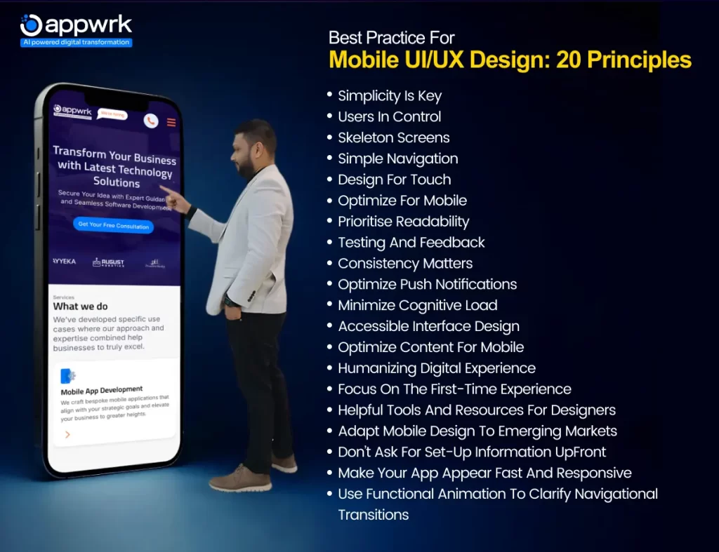
Best practice for mobile UI/UX Design: 20 Principles
In today’s era of cut-throat online competition, designing a mobile app that truly stands out from the crowd and leaves a lasting impact requires a deep and comprehensive understanding of UI principles, user behavior patterns, and the latest advancements in mobile technology. The user interface (UI) design plays a significant role in shaping that experience. A well-designed UI not only attracts users but also retains them by providing an intuitive and enjoyable interaction with the app.
Simple Navigation
There’s no denying that good navigation is a vital part of a successful website, impacting a range of factors, including user experience, accessibility, and SEO. It involves minimizing the number of steps required to reach a desired destination and ensuring that navigation elements are consistently placed and easily recognizable. A well-designed navigation system contributes to a positive user experience by reducing confusion and frustration, ultimately increasing user engagement and satisfaction.
Standard navigational features, such as tab bars (for iOS) and drawers (for Android), ease the navigation process for users because they are familiar with them. Designers often prioritize navigation based on how users interact with the app to increase user engagement. Assigning priority levels, such as high, medium, and low, ease the way users frequently use the app. You can also increase user interaction by using clear and primary navigation symbols throughout your mobile application.
Focus On The First-Time Experience
Did you know that a seamless first-time user experience can increase user retention by up to 50%? A well-designed onboarding process not only reduces frustration but also builds confidence and loyalty, significantly enhancing your overall satisfaction and likelihood to continue using the product. It’s crucial to prioritize clarity and simplicity, avoiding overwhelming users with excessive information or complex setup processes. Instead, focus on providing immediate value and a sense of accomplishment, encouraging users to explore further and become loyal advocates. By creating a positive and memorable first impression, you can significantly increase user retention and the overall success of your mobile app.
Users In Control
It goes without saying that when users feel in control of mobile apps, they are more likely to have a positive user experience. This sense of control can be established by providing users with clear navigation, predictable layouts, and feedback on their actions. Predictive features and familiar elements help users navigate the mobile app easily and efficiently. Additionally, predictive features like auto-fill or suggestions can streamline interactions and reduce cognitive load, further enhancing the sense of control. By implementing these elements, designers empower users to navigate the app confidently and efficiently.
In particular, meaningful error messages, the availability of predictive features, and the correct functioning of the back button have a positive impact on perceived control, which in turn helps to influence the level of user engagement. A well-functioning back button also enhances users’ operations when completing forms and quizzes.
Accessible Interface Design
In mobile application design, accessibility is a key principle that guarantees all users, including those with disabilities, can engage effectively with the application. Making your mobile app visually, audibly, motor, and cognitively friendly not only for non-impaired people but for anyone with disabilities. In doing this, you make the site accessible to everyone, ensuring that every user has the best experience. Key aspects of accessible interface design include:
Screen Reader Compatibility: Ensuring that screen readers can accurately interpret and convey the app’s content and functionality to users who are visually impaired.
Adjustable Text Sizes: Offering possibilities to adjust text sizes to improve the read – only the most important features should be integrated here.
Clear Color Contrasts: Using color combinations that provide sufficient contrast between text and background elements, making it easier for users with visual impairments to distinguish content.
Alternative Text for Images: Descriptive text (alt text) should be included for images so screen readers can convey the visual content to users who cannot see it.
Keyboard Navigation: Creating a consistently logical layout of the navigational scheme so that it is easily understandable and operated by users who suffer from certain cognitive disorders.
Use Functional Animation To Clarify Navigational Transitions
In mobile app design, incorporating functional animation can significantly elevate the user experience by providing visual cues that clarify the relationship between different screens and elements during navigation. These subtle and purposeful animations guide users through the app’s interface, helping them understand how their actions trigger transitions and changes in the content displayed.
For instance, when a user taps on a list item, a smooth animation could expand the item to reveal additional details, visually supporting the connection between the two states. Similarly, when transitioning between screens, a subtle slide or fade animation can indicate the direction of movement and the information hierarchy.
By thoughtfully integrating functional animation, designers can create a more intuitive and engaging experience, minimizing confusion and enhancing the overall flow of the app. This approach improves usability and adds a layer of visual delight, making the app feel more polished and responsive. Remember, the key is to use animation purposefully and sparingly, ensuring it complements the user experience without becoming a distraction.
Don’t Ask For Set-Up Information UpFront
When users first download your app, they’re eager to explore its core features and benefits. Bombarding them with lengthy registration forms or requests for personal information creates friction and can lead to immediate abandonment. Instead, prioritize a smooth onboarding experience that allows users to experience the value your app offers quickly.
You can always collect necessary information later once users can engage with the app and understand its benefits. This approach improves the initial user experience and increases the likelihood of users completing the setup process once they’re invested in the app. Remember, the goal is to make the onboarding process seamless and user-friendly, encouraging users to continue using and exploring your app.
Make Your App Appear Fast And Responsive
In the realm of mobile app design, speed is paramount. Users expect apps to be fast and responsive, and any delays or lags can lead to frustration and abandonment. To create a positive user experience, it’s essential to optimize your app’s performance and implement strategies that enhance its perceived speed.
Key Techniques to Improve Perceived Performance:
Loading Animations and Progress Indicators: To manage user expectations and provide visual feedback during operations that might take time, such as loading data or processing requests. Loading animations, progress bars, or spinners assures users that the app is actively working and prevents them from feeling like the app has frozen or crashed.
Lazy Loading: Defer the loading of non-essential content or elements until they are needed. This approach reduces the app’s initial loading time and improves responsiveness, especially on slower networks or devices.
Pre-fetching Content: Anticipate the user’s next actions and pre-load relevant content in the background. This technique minimizes delays when users navigate to new screens or interact with different features, creating a seamless and responsive experience.
Skeleton Screens
Let’s face it, waiting for a website or app to load can be frustrating and can lead to user abandonment. To address this issue, using skeleton screens will be your best bet. Also known as placeholders, skeleton screens are a design pattern that appears on a page while it’s loading, giving users a visual indication of what the page will look like when it’s finished. This technique helps users to get visual feedback and can be useful to show them that the app is working and doing something in their background, preventing them from thinking that the app is frozen.
Skeleton screens can be exceptionally useful when content loading may be slow, for example, when the data is fetched from the server or when some calculations are being made. If applied, skeleton screens help to achieve a more active interface, which, while waiting, can offer interaction in cases where waiting is inevitable.
Optimize Content For Mobile
You may have a high-quality and feature-rich application, but if the content on the app is not optimized for mobile screens, what good is it? Mobile content optimization is all about transforming the content in the mobile handset to fit into the small display with touch control ability. This includes keeping text brief and to the point and employing capitals and bullets where necessary. Graphics and certain videos should be optimized to load faster, and large passages of text should be split up.
Further, you might want to employ the usage of responsive design elements to ensure that the content on any gadget is viewed in the right format depending on the size and the orientation. When you prioritize, you can make your content better viewed and more pleasing on any platform someone chooses to view your content from, whether it is a desktop or a mobile.
Design For Touch
Due to the fact that mobile devices primarily interact with touch, optimizing an app for touch interactions is vital. This involves considering finger size and touch targets, ensuring buttons and interactive elements are large enough and spaced appropriately for easy and accurate tapping, and incorporating gestures like swiping, pinching, and zooming intuitively, allowing users to navigate and interact with the app effortlessly.
Additionally, providing haptic feedback for touch interactions can enhance the user experience by confirming actions and providing a sense of physicality. By prioritizing touch-friendly design, you create a more intuitive and enjoyable experience for mobile users.
Humanizing Digital Experience
Mobile app UX design is not wholly about usability, features, content, and navigation but also about the feeling that the user experiences while using the mobile app. In mobile app design, humanizing the digital experience is essential for fostering a genuine connection with users. It involves infusing the app with elements that evoke emotions, create a sense of empathy, and establish a more personalized and engaging interaction.
By incorporating human-centric design principles, you can transform a purely functional app into a delightful and memorable experience. Key strategies for humanizing the digital experience include:
Personality and Tone: Infuse your app with a distinct personality and tone of voice that reflects your brand values and resonates with your target audience.
Personalization: Leverage data and insights to tailor the app experience to individual users.
Storytelling: Use storytelling techniques to create a narrative that connects with users on an emotional level.
Feedback and Recognition: Acknowledge and appreciate user feedback and recognize their achievements and milestones.
Optimize Push Notifications
According to the survey conducted by Appiterate, 71% of mobile apps get uninstalled due to the annoying push notifications that serve no importance to the user. Not all users avoid notifications and ads when using an app, but the value proposition should be high enough to make the interruption worth it. Push notifications elevate the value and use app viewing data to give notifications, making the notifications look customized. Too many notifications bombarding in a short period of time increase confusion and annoy the user, who is unable to process the information. Push notifications should deliver timely and relevant information that enhances the user experience. Personalize notifications based on user preferences, behavior, and location to increase their value and engagement. Segment your audience and tailor notifications accordingly to avoid sending irrelevant or annoying messages.
Optimize For Mobile
Users often need to pause an app for other tasks, and apps that resume from where they left off enhance the user experience. Designers must consider interruption as an important feature when building an app to increase user experience.
Using the mobile phone’s utmost capabilities also elevates the user experience and eases daily work. Mobile phones have many sensors installed, such as cameras, GPS, Biometric authentication, and more. When utilized, these sensors increase user interaction and engagement. Cameras are often used to scan, take photos, and analyze texts, and biometric authenticators ease security and shorten the locking-unlocking time. On the other hand, you can also find your real-time location by using GPS.
Adapt Mobile Design To Emerging Markets
One of the, if not the most prominent, factors affecting mobile app engagement is poor connectivity. Faraway places often have unstable internet connections. Developers must consider factors like device capabilities, network connectivity, and cultural nuances. Optimize your app’s performance for low-bandwidth environments and ensure compatibility with a wide range of devices. By tailoring your design to the specific context of emerging markets, you can create a more accessible and engaging experience for users in these regions, expanding your app’s reach and impact.
Limited data is another factor limiting your user base, and apps optimized with file size can be utilized with data as low as 250MB. This increases user interaction and engagement. Consider this factor to increase the user base, and this can be achieved by optimizing the app for the data utilized. Apps that are lag-free and have images and animation of low bit size don’t take time to load and are suitable for places with poor internet connections.
Both testing and getting users’ feedback are important stages within the mobile app design. This process allows for the identification of all the problems that may hinder user interfacing, bugs, or poor performance, which would otherwise hamper the functioning of the application when released to the public domain. It gives the developer confidence that the app will go as planned, and more importantly, user-friendliness will be achieved. Meanwhile, the user feedback helps to understand how users use the application, what they like, and what they do not like.
You cannot sit and watch how your app is being used without participating in the process and making changes where necessary for the benefit of users. Testing and feedback do not stop at the end of any given level; they should run throughout an application’s lifecycle, including how often the application is updated.
Minimize Cognitive Load
Cognitive load is the amount of mental effort that is utilized to process the information on the mobile application. If your app is flooded with unnecessary information and pop-ups, the human mind will reject it because it will get bored. The human brain can capture and process limited information compared to mobile applications that contain too much information, complex menus and submenus, interferences, and pop-up advertisements, which may force the brain to leave the mobile application. Depending on the idea of heading towards a simpler mobile app design, and intuitive and complication-free menu layouts assist the users in understanding the purpose of the application more accurately and using it more effectively.
To counter the problem of excessive cognitive load, designers often apply these methods to achieve better results:
Decluttering
Offload Tasks
Converting Tasks Into Bite-Sized Chunks
Use Familiar Screens
Minimizing User Inputs
Design For Thumb
In app design, it’s crucial to prioritize the user’s primary interaction tool, their thumbs. Designing for thumbs involves considering the natural movement and reach of the thumb when interacting with a mobile device. Key aspects to consider include:
Thumb Zones: Strategically place interactive elements within easy reach of the thumb, considering both left- and right-handed users.
Gesture-Based Interactions: Incorporate intuitive gestures, such as swiping, tapping, and pinching, to enhance usability and minimize the need for precise finger movements.
Button Size and Spacing: Ensure buttons and touch targets are large enough and adequately spaced to accommodate thumb interaction, reducing accidental taps and improving accuracy.
Simplicity is key
Mobile application design especially stresses the idea that simplicity is king. There is also a lot of emphasis on the new generation of users who prefer applications that are easily understandable with neat interfaces. By restricting oneself to necessity and offering only the basic features and options, designers should be able to produce a fantastic, comfortable, and effective app for users.
Elimination of clutter means that the interface should contain as few items as possible to enhance users’ experience; simplicity refers to the ability of the interface to bring together as many aspects of usage as possible by providing effective solutions that are not overwhelming and clearly labeling items and icons. Consequently, the designers can improve the general atmosphere, thereby making the app much more fun and exciting. Finally, an app that is easy to use and clearly designed will have a higher chance of being utilized by people in our society.
Consistency matters
Consistency in mobile app design is crucial for creating a seamless and intuitive user experience. By maintaining uniformity in visual elements, navigation patterns, and interaction behaviors, you establish a sense of familiarity and predictability for users. This reduces cognitive load and allows users to focus on the app’s content and functionality rather than deciphering a constantly changing interface.
Consistent use of colors, typography, icons, and button styles creates a cohesive and professional look and feel. It reinforces your brand identity and helps users recognize and connect with your app across different screens and features. Furthermore, consistent navigation patterns, such as using a familiar tab bar or hamburger menu, enable users to intuitively explore the app and find the information they need.
Prioritise readability
In mobile app design, prioritizing readability is essential for ensuring a positive user experience. Readability encompasses several factors, including font size, font type, color contrast, and line spacing. By selecting fonts that are easy to read on smaller screens, using appropriate font sizes, and ensuring sufficient contrast between text and background colors, designers can significantly improve the overall readability of their app’s content.
In addition, decisions regarding line height and paragraphs could improve the text readability and the way in which users read content, scan information. When readability is a top priority, designers can make it much easier to use and understand what the application has to offer. That’s right, friends: a ‘readable’ app is actually a more usable and enjoyable app.
Final thoughts
At the end of the day, designing a mobile app that stands out in today’s competitive market is no small feat. It requires a perfect blend of aesthetics, functionality, and seamless user experience. By following the above-mentioned best practices in mobile app design, you can create an app that not only looks great but also delights users with its ease of use and performance.
Why Choose APPWRK for your Exceptional Mobile App Design?
Want to create intuitive and innovative UI/UX for your mobile device that will help increase your user base? Or want transform your mobile app with a unique design and better user experience? At APPWRK, an app development and AI-driven digital transformation company, we understand that exceptional mobile app design is the cornerstone of user engagement and app success.
Our team of experienced designers and developers is dedicated to crafting intuitive, visually appealing, and user-friendly mobile experiences that drive results. We combine a deep understanding of design principles with the latest technologies and industry best practices to create apps that not only meet but exceed user expectations. Contact us now for creative mobile app UI/UX design.
FAQs
What are Helpful Tools And Resources For Designers?
The world of mobile app design is constantly evolving, and designers need to stay updated with the latest tools and resources to create exceptional user experiences. Here are some valuable resources that can aid designers in their journey:
Design Software: Tools like Sketch, Adobe XD, Figma, and InVision are popular choices for creating wireframes, prototypes, and high-fidelity mockups.
Prototyping Tools: Tools like Marvel, Framer, and Proto.io enable designers to create interactive prototypes for testing and user feedback.
User TestinEhng Platforms: Platforms like UserTesting, UsabilityHub, and Validately facilitate user research and testing to gather valuable insights.
Design Communities and Forums: Online communities like Dribbble, Behance, and Designer News offer inspiration, feedback, and networking opportunities.
What is mobile app design specification?
A mobile design specification document is an important tool for communicating your vision, requirements, and goals for your mobile app. It helps align your customers, stakeholders, teams, and clients with the project’s scope, functionality, and features.
How do you design a mobile app layout?
Designing a mobile app layout involves creating a user-friendly and visually appealing arrangement of elements on the screen. It requires careful planning and consideration of user experience. The steps to design a mobile app layout include:
List down all the screens of your mobile app.
Create a layout detailing when each screen will appear.
Optimize the primary operations for better accessibility.
Make your app screen visualized.
Design your screens with the help of tools and software.
What are the five features of UX?
The five key features of UX design, spanning the entire design process, encompass strategy, scope, structure, skeleton, and surface. These elements ensure a user-centric approach, defining the project’s goals and requirements, organizing content and information, creating wireframes and prototypes, and finally refining the visual and interactive elements for an optimal user experience.
What are examples of Mobile App Design?
There are numerous examples of outstanding mobile app design. Popular apps like Glo Yoga, Grubhub, and Spotify showcase intuitive interfaces, seamless navigation, and visually appealing aesthetics. These apps effectively demonstrate how thoughtful design can enhance user experience and contribute to an app’s overall success.
Gourav Khanna is the Co-founder and CEO of APPWRK, leading the company’s vision to deliver AI-first, scalable digital solutions for enterprises and high-growth startups. With over 16 years of leadership in technology, he is known for driving digital transformation strategies that connect business ambition with outcome-focused execution across healthcare, retail, logistics, and enterprise operations.
Recognized as a strategic industry voice, Gourav brings deep expertise in product strategy, AI adoption, and platform engineering. Through his insights, he helps decision-makers prioritize market traction, operational efficiency, and long-term ROI while building resilient, user-centric digital systems.


